

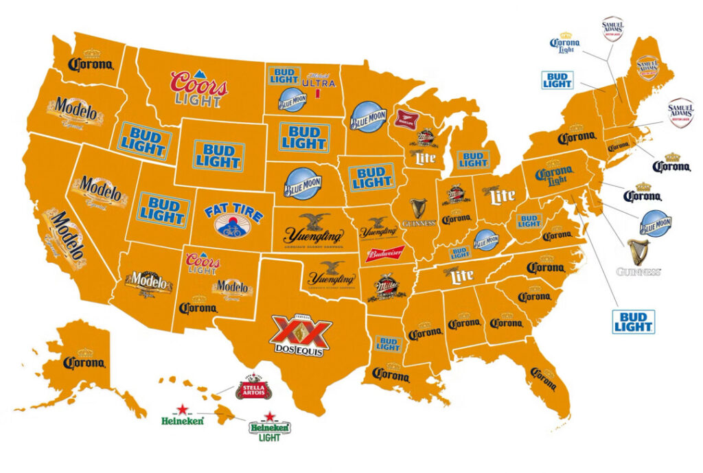
If you’ve scrolled through a lifestyle feed or a local news site today, you’ve likely run into a colorful, highly shareable graphic titled “The Most Popular Beer by State, According to Google Trends.” The article accompanying the map walks you through a fascinating narrative of American geography: West Coast states are deeply curious about Modelo Especial and Corona, Midwesterners are searching for legacy lagers, and New Englanders are obsessed with local craft IPAs.
It’s a harmless, fun piece of light reading. But if we apply some simple, street-level logic to the data, the entire premise of the “regional beer map” collapses into a marketing mirage.
Google Trends is a highly valuable tool for tracking real-time public curiosity, but search volume is not the same as consumer preference, and it certainly doesn’t equal actual retail sales. When a person types a brand name into a search bar, they are often reacting to a viral commercial, a recall notice, a controversial public statement, or a massive sporting event. They aren’t placing an order; they are simply asking a question.

By treating search-bar curiosity as a definitive cultural identity, lifestyle publishers are pulling off a clever bait-and-switch. They take raw, volatile search logs, slap a slick “regional preference” label on them, and sell it back to us as a heartwarming reflection of local culture.
Why do they do this? Because the modern digital newsroom is completely starved for resources, and the algorithms demand a constant, high-volume flow of cheap, clickable content. Writing a deeply researched, investigative piece on the monopolization of the global beverage industry takes weeks of actual journalistic work. Sifting through the Google Trends API and generating a colorful beer map takes a single afternoon.
The irony is that while these maps celebrate our supposed “regional diversity,” the actual American beer market is more consolidated and monopolized than ever before. Two or three global megacorporations control the vast majority of the brands displayed on those colorful maps. Whether you’re drinking a legacy Midwestern lager or a West Coast imported pilsner, your dollars are likely flowing into the exact same offshore corporate bank accounts.
The “Google Beer Map” doesn’t reflect our local tastes; it reflects our algorithmic predictability. It’s a cheap digital mirror designed to keep us scrolling and clicking, distracting us from the quiet, corporate centralization of our daily lives. The next time you want to connect with your local culture, put down the search bar, close the map, and go support an actual, independent local business.